





BRAND STRATEGY · BRAND IDENTITY · BRAND ASSETS
A brand that makes you want to stay a little longer.
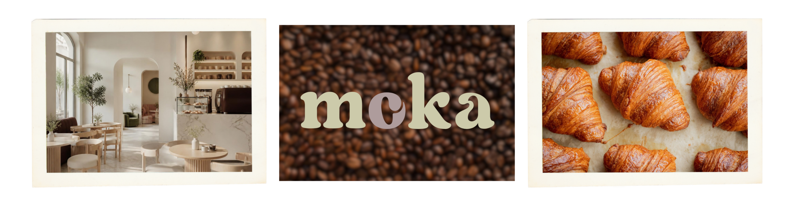
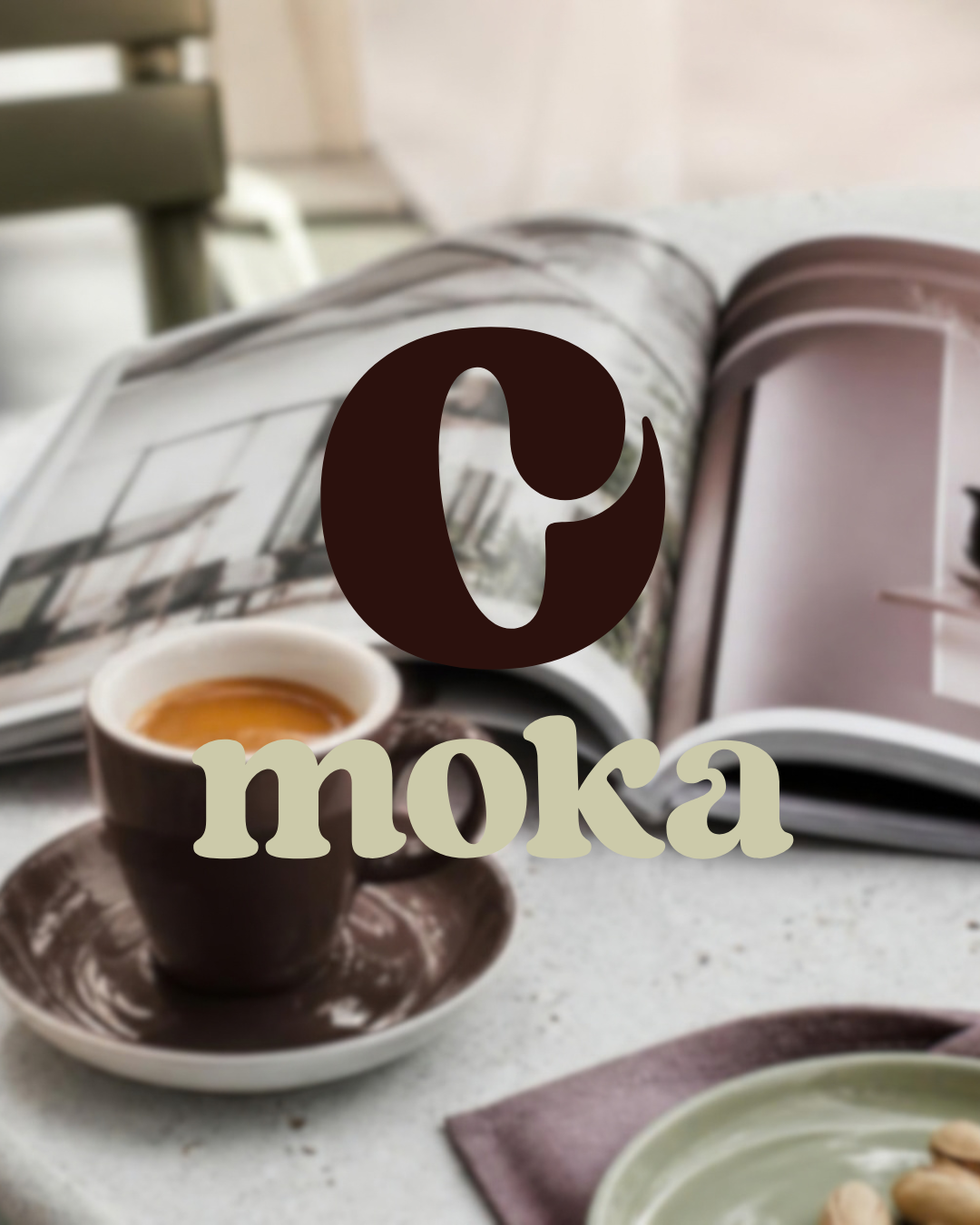
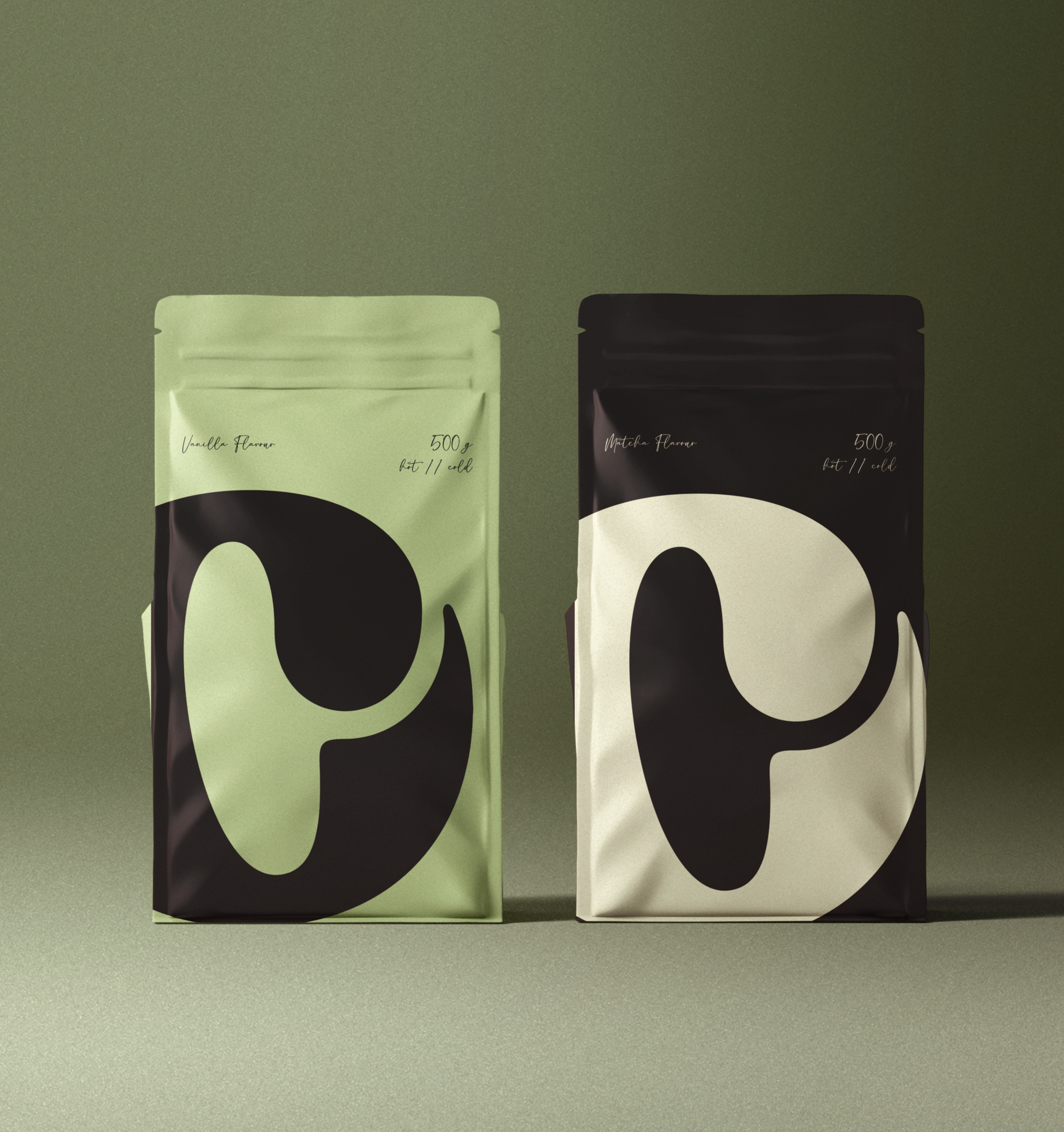
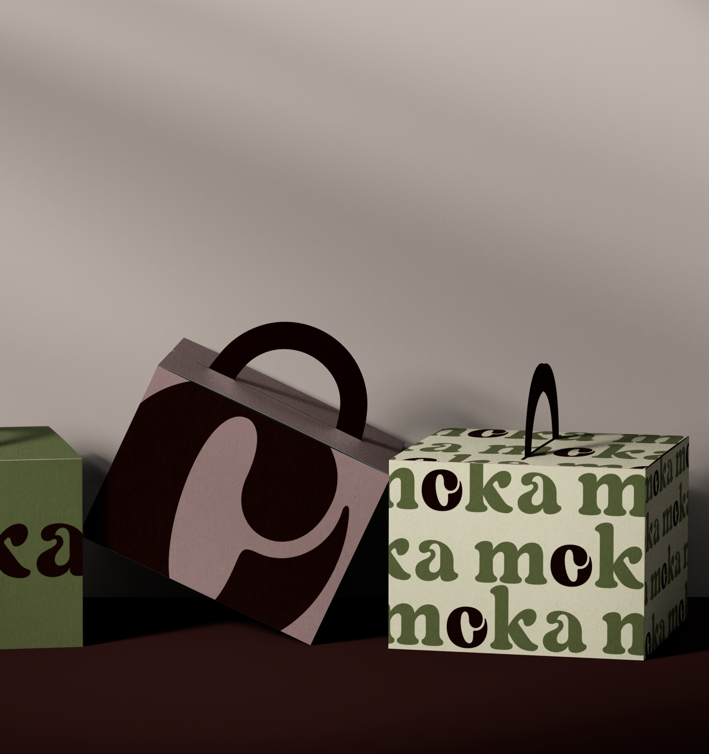
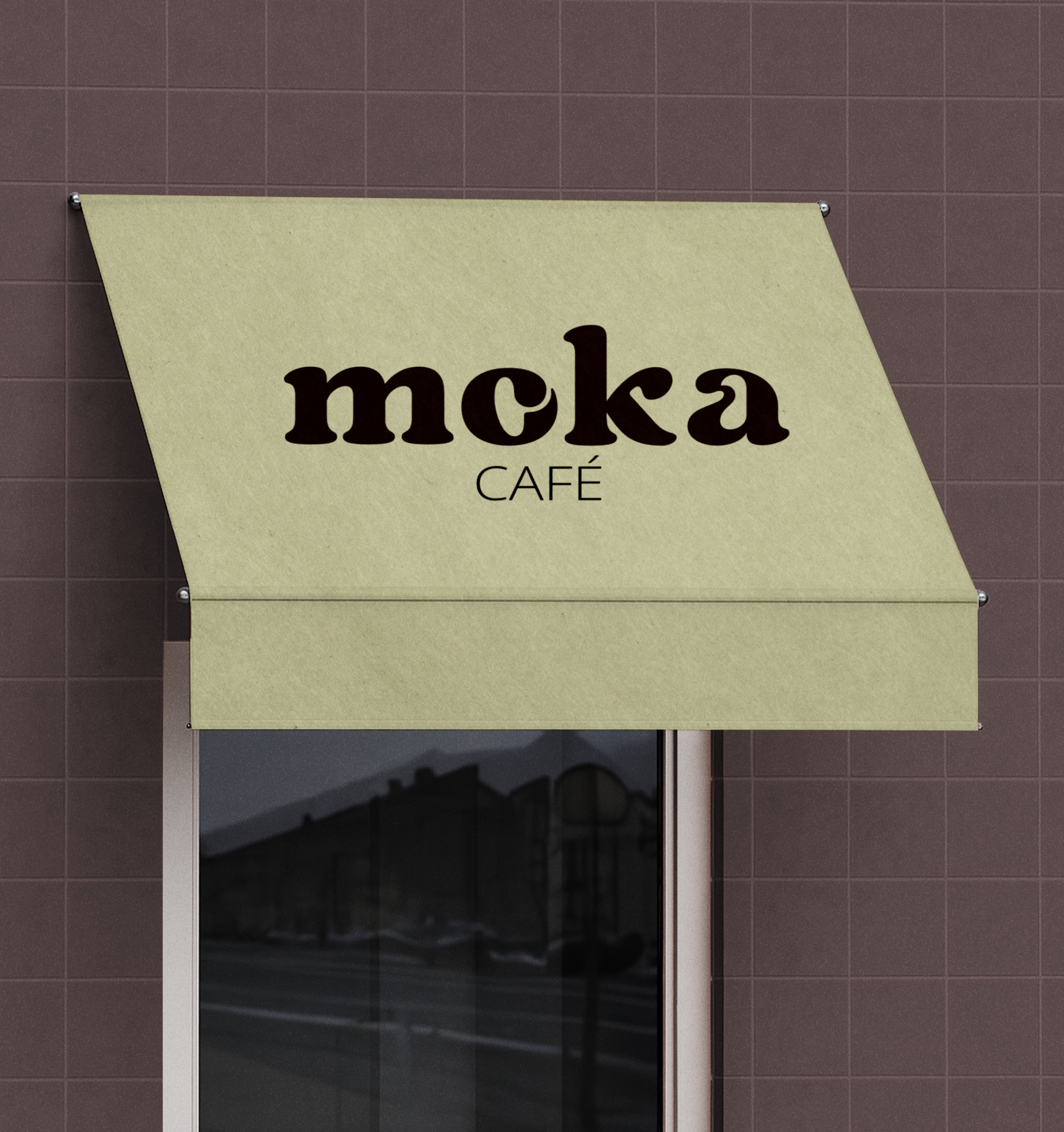
Moka Café branding combines strategic brand development with a modern, distinctive brand identity. Deep chocolate brown, soft pistachio green, warm off-white and expressive typography create a unique brand world that blends classic café culture with contemporary design.
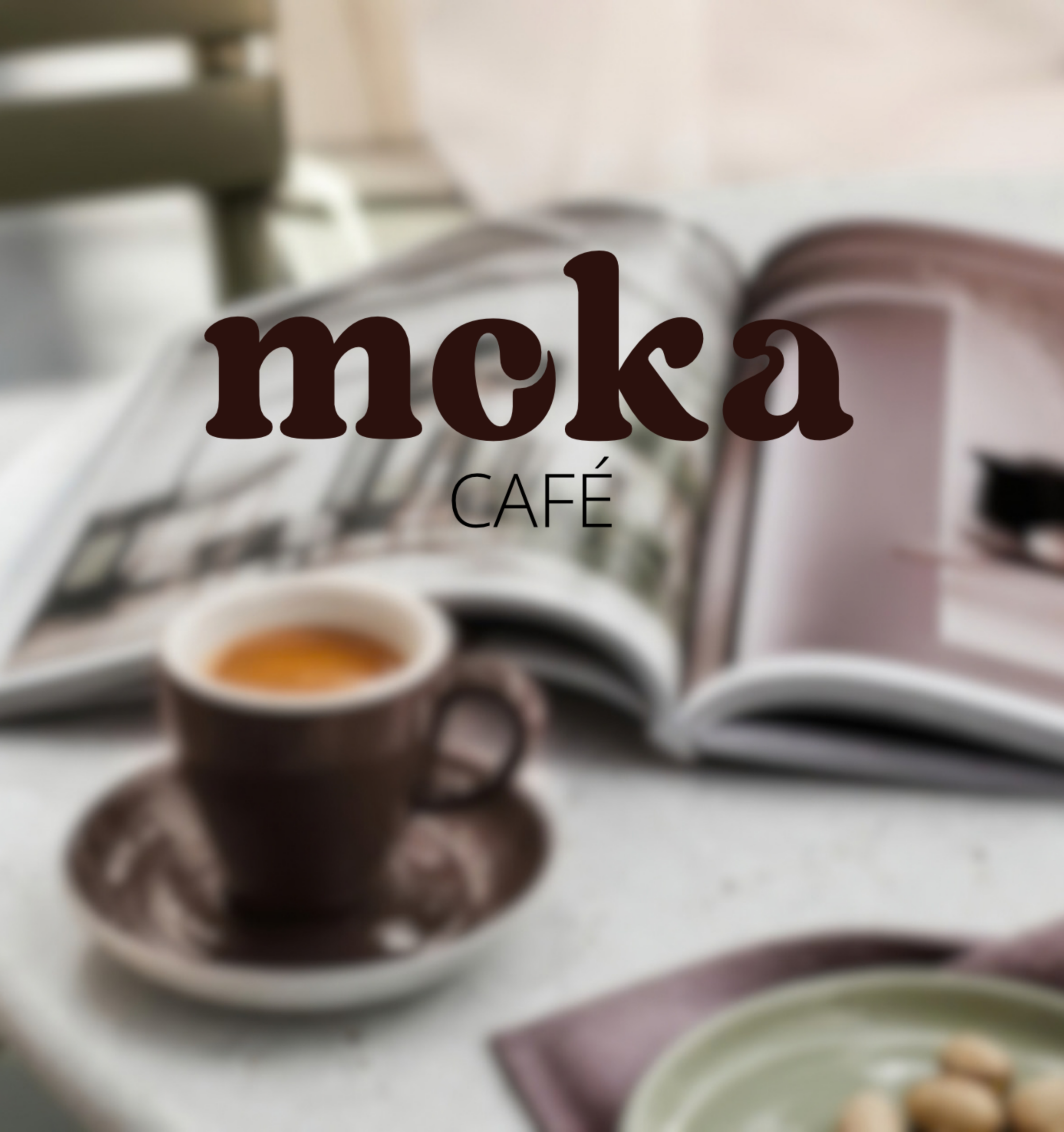
Moka Café is all about good coffee, little breaks and those moments when you feel like staying just a little longer. It's about more than your next coffee: it's a little ritual to weave into your everyday life.
This feeling became the starting point for the entire brand world. The result is a warm, distinctive identitythat combines classic café culture with modern aesthetics.
Deep chocolate brown, soft pistachio and warm off-white with a hint of yellow meet expressive typography, clean shapes and thoughtful details. Together, they create a brand world that feels familiar yet distinctive.
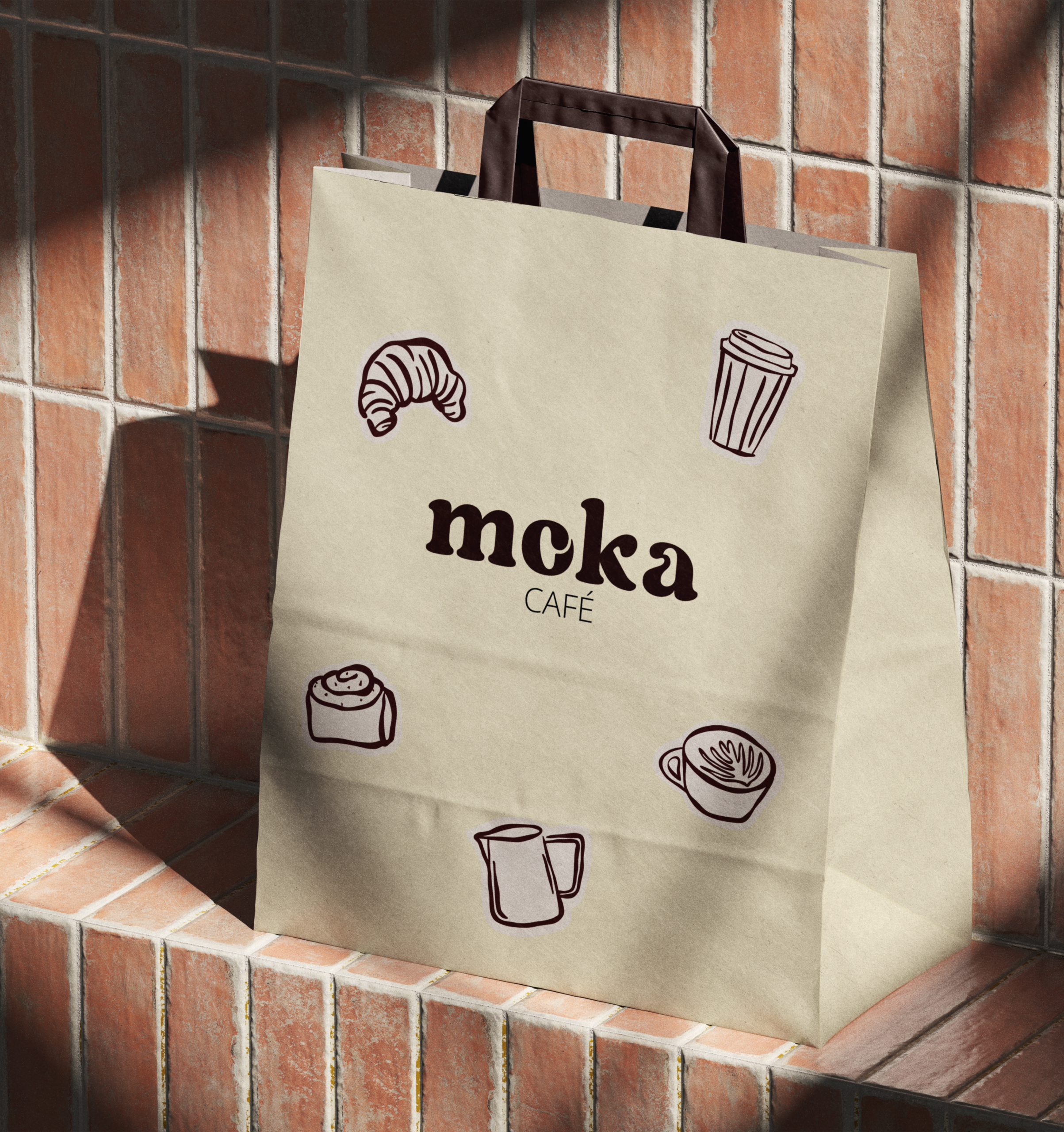
From strategic positioning to visual identity and individual brand assets, a cohesive brand presence was developed to give moka a character all its own.
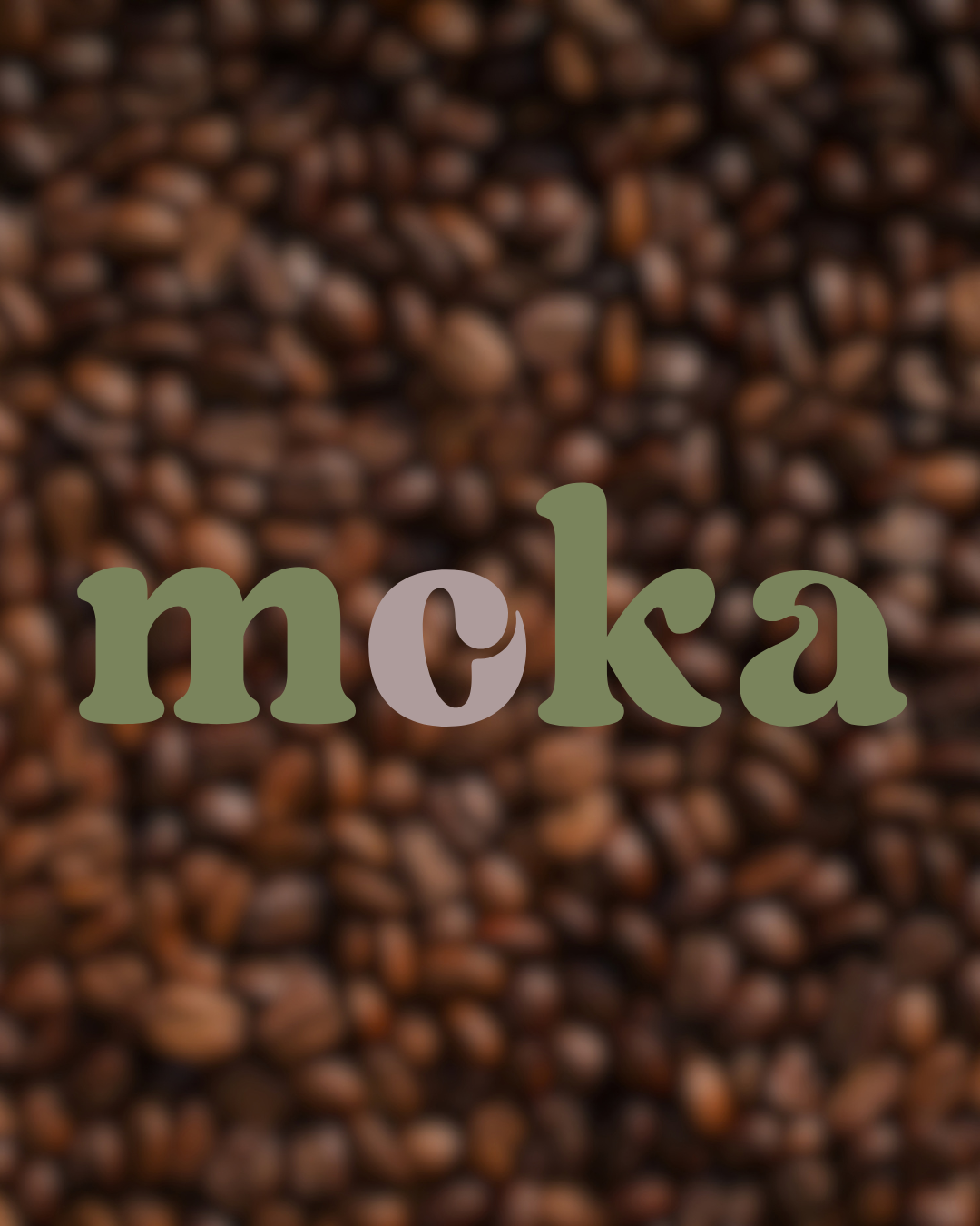
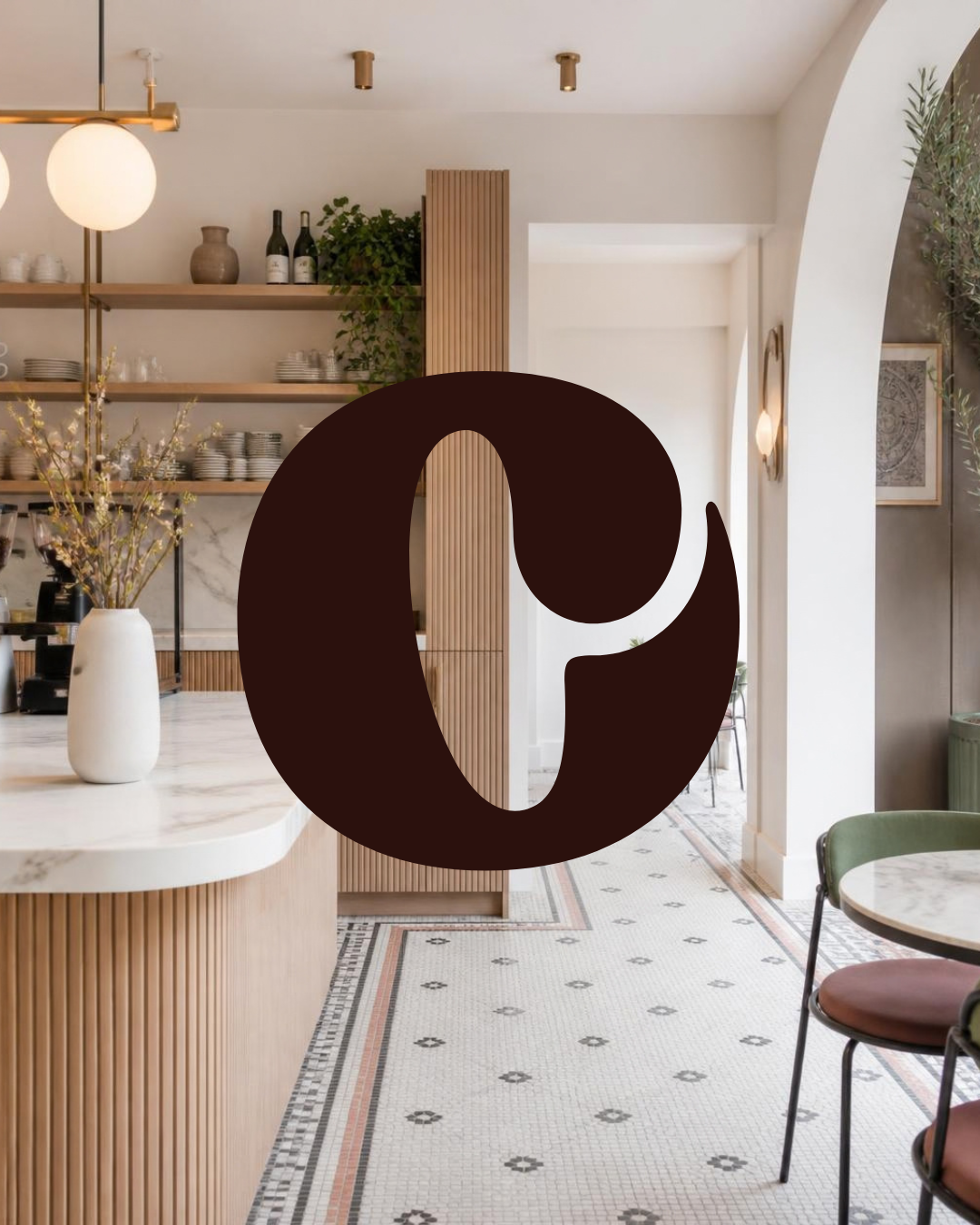
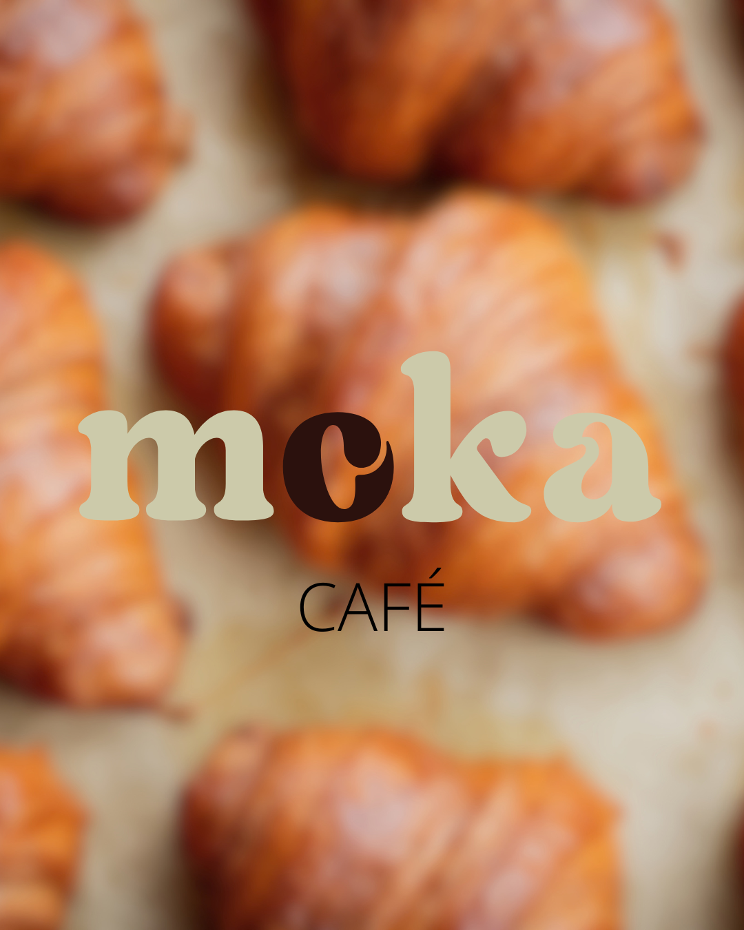
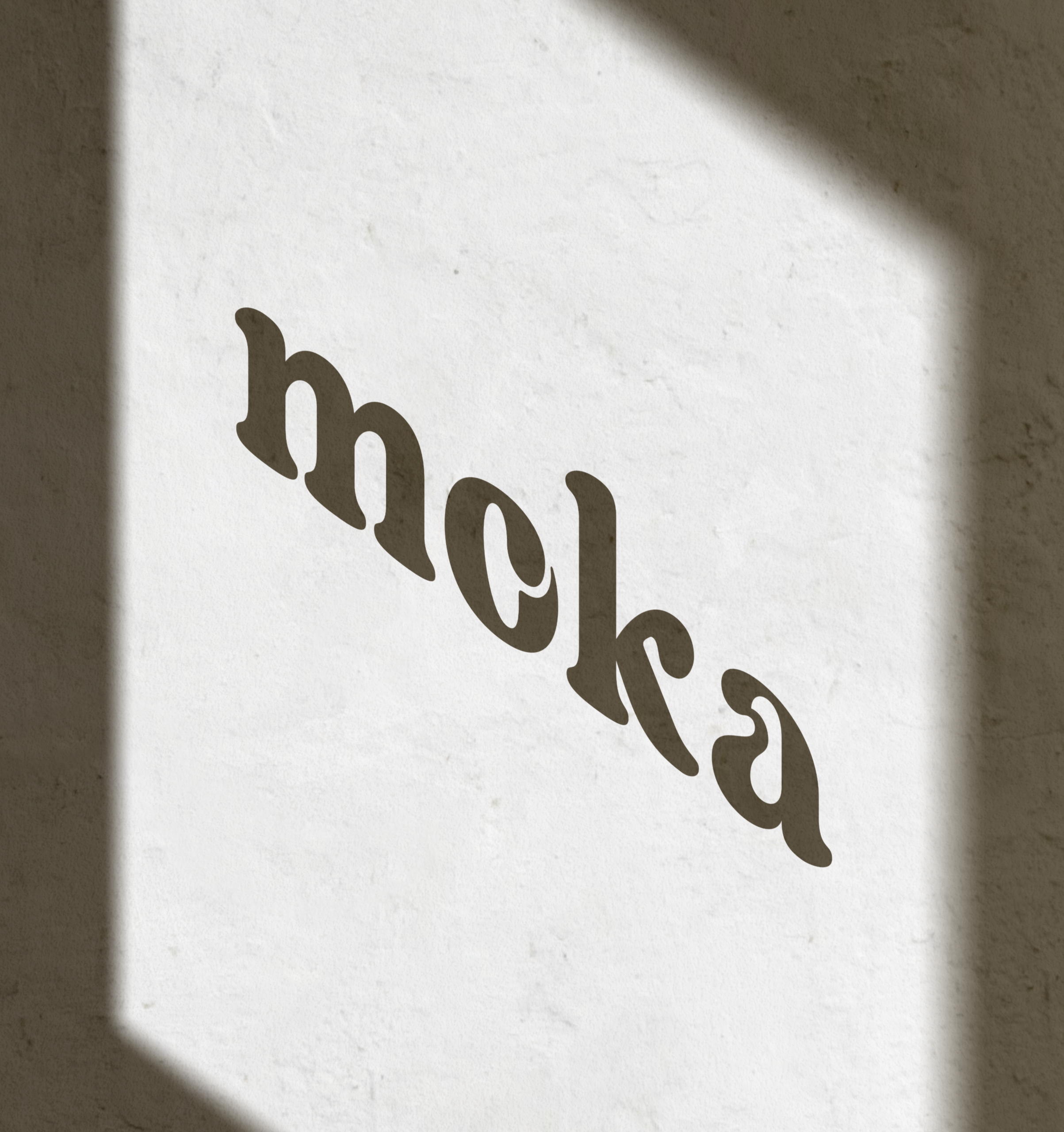
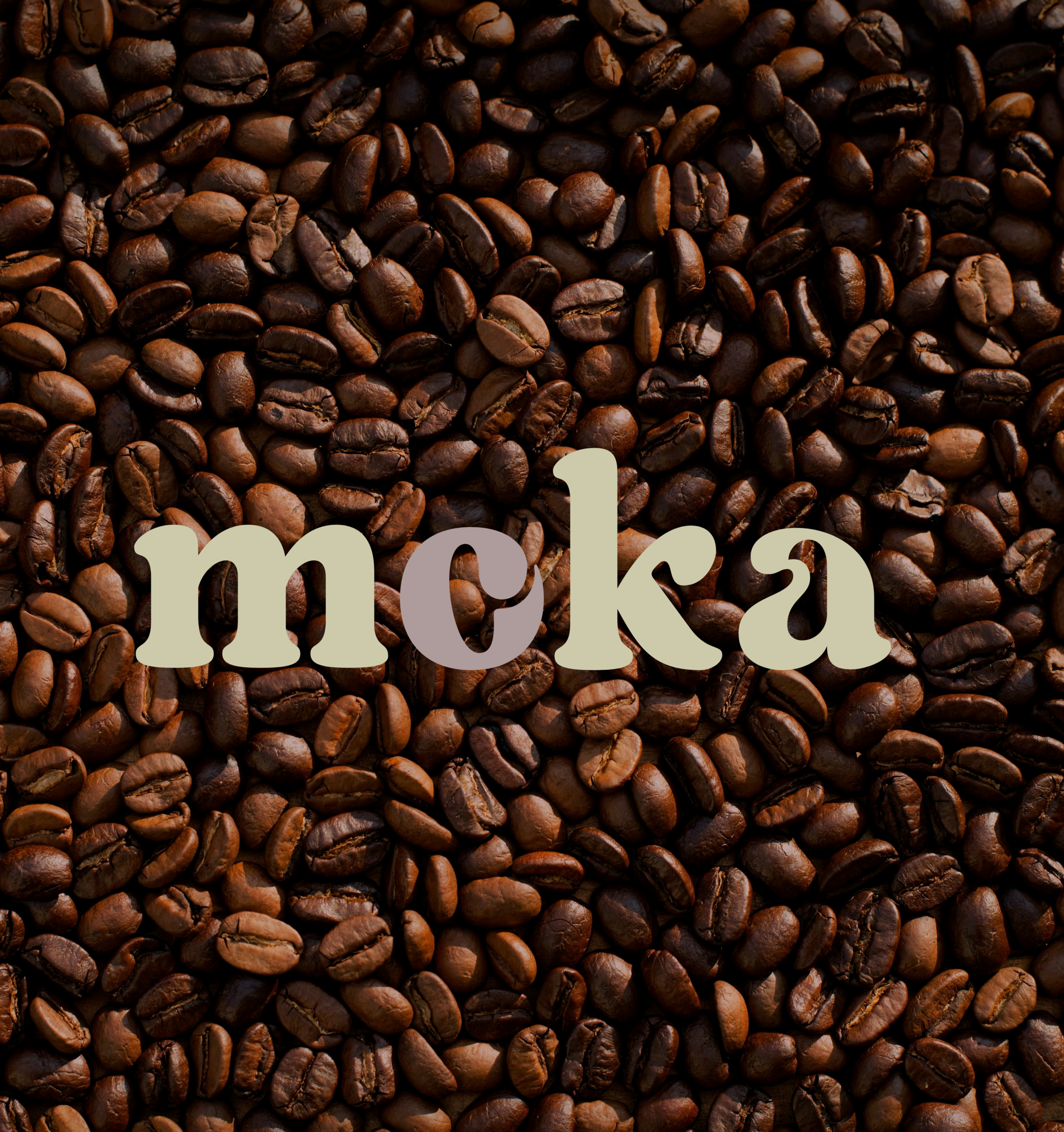
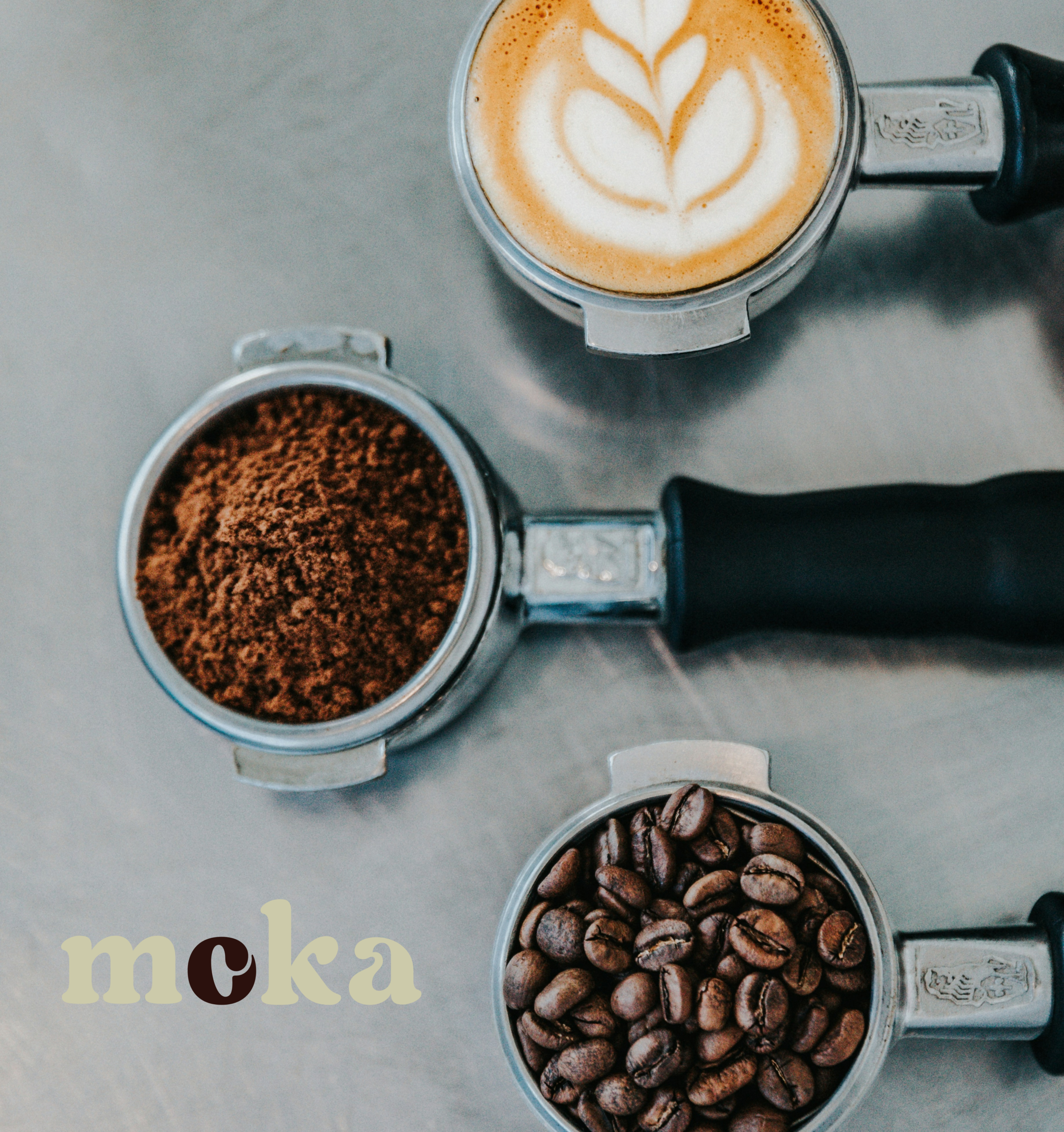
Moka's identity is built around the deliberate contrast between expressive typography and clean, understated design eIements.Regards Regular brings personality to the design through its distinctive letterforms, while Open Sans adds clarity and readability.
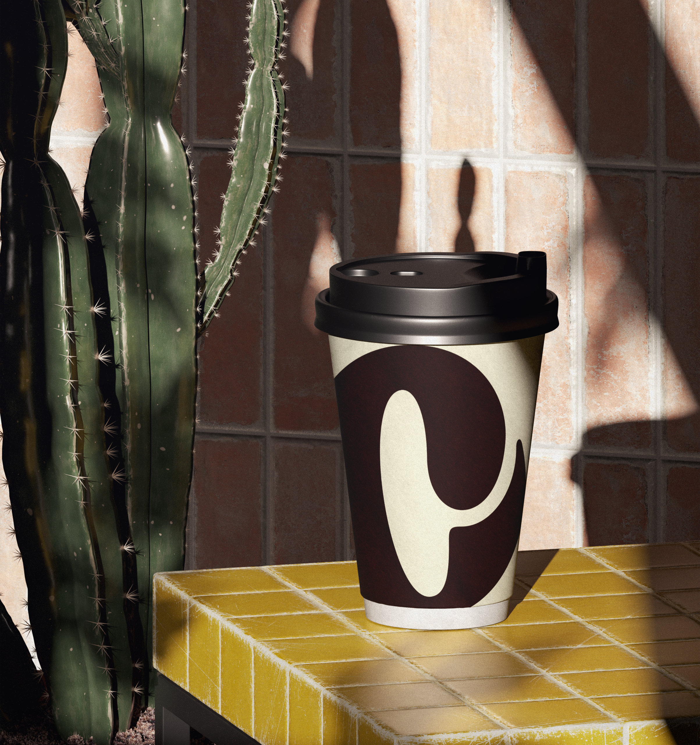
Deep chocolate brown forms the foundation of the colour palette, balanced by touches of pistachio and off-white. Generous colour blocks, oversized typography and subtle graphic accents capture the slightly nostalgic, playful character of the café .
The result is a brand world that feels familiar and full of character rather than interchangeable; just right for a café that turns an everyday coffee into a little ritual.
You want to build your brand strategically or take it further? Let’s explore what your brand can become.

Strategic branding & design that makes your brand stand out.